Why People Don’t Trust Your Website (Yet)
When someone lands on your site, they arrive with their guard up. They’re asking themselves:
- “Is this legit?”
- “Am I going to waste my money?”
- “Is this another overhyped thing that won’t work?”
A lot of business owners try to fix this by throwing everything on the page—badges, logos, testimonials. But more isn’t better. If your trust signals feel generic or fake, they actually hurt trust.
Trust isn’t built by having more stuff. It’s built by showing the right things at the right moments in someone’s journey.
How Digital Trust Really Works
Trust online is emotional first, logical second.
When someone hits your homepage, their brain quickly scans for answers to:
- “Does this feel safe?”
- “Do these people seem real?”
- “Is this worth my time?”
This happens in a split second, before they’ve fully read anything.
Imagine walking into a physical store where:
- No one greets you
- Prices are unclear
- The return policy is hidden in tiny text
You’d probably walk right out.
Your website can give people that same uneasy feeling if:
- Important information is hard to find
- Things look messy or unprofessional
- It’s not clear what you do or how you help
And online, it’s even worse—people can’t see your face, touch your product, or feel your energy. So they judge you based entirely on what they see on the screen.
The 7 Trust Triggers
These are the main things that help turn skeptical visitors into paying, loyal customers.
1. Testimonials That Actually Mean Something
Random “They’re great!” quotes don’t convince anyone.
The testimonials that build trust:
- Speak to specific fears or doubts your ideal customer has
- Sound like real people, not polished marketing
- Show a before and after (what life was like before, and what changed)
The best lines often start with things like:
- “I was skeptical at first…”
- “I almost didn’t buy this because…”
- “I had tried so many things before, and nothing worked…”
A few examples from the testimonials we’ve received:
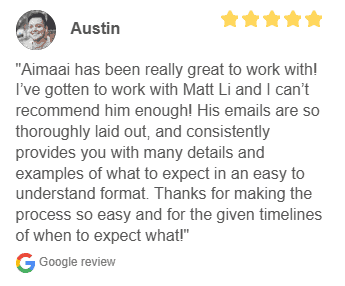


Why this works: Your visitor is currently skeptical. When they see someone else who felt the same way but still got results, it feels believable. Where to place your testimonials:
- Near pricing sections
- Next to “too good to be true” claims
- Before or around the checkout area
Put the right testimonial by the right moment of doubt.
2. Reassurance Through Risk Reversal
Every purchase feels risky.
In your visitor’s mind, they’re thinking:
- “What if this doesn’t work for me?”
- “What if I waste my money?”
- “What if I regret this?”
Your job is to reduce that risk as much as you can.
You can do this with things like:
- Money-back guarantees
- Free trials or demos
- Clear, fair refund and cancellation policies
But here’s the key: Don’t bury this info in your footer or some tiny legal page. Show it clearly where the anxiety is highest—usually near the “Buy” button and pricing sections.
Also, explain why you can confidently offer that guarantee. For example:
“We offer a 30-day money-back guarantee because we’ve seen this work for hundreds of customers, and we want you to feel safe trying it.”
That kind of honesty helps people relax.
3. Showing You Truly Understand Them (Empathy)
People trust you more when they feel understood, not just targeted.
This goes beyond saying:
- “We help busy professionals save time.”
Instead, tap into what it feels like:
- “You’re tired of ending the day exhausted, with a to-do list that somehow got longer, not shorter.”
Good empathy signals:
- Use the same words your customers use
- Describe their emotional state (frustrated, overwhelmed, stuck, confused)
- Acknowledge their fears and past disappointments
When someone reads your page and thinks, “Wow, that’s exactly how I feel!” that’s the moment trust begins.
4. Security Signals That Calm the Nervous Brain
When people enter their details or payment info, they’re asking:
- “Is this safe?”
- “Will my card details be okay?”
- “Are these people legit?”
You can ease those fears with:
- Secure checkout badges (SSL, payment processor logos)
- Visible privacy policy links
- Professional, clean design
- Clear, simple forms
But it’s not just about technical security. Everything on your site gives off signals about your reliability:
Positive signals:
- Consistent branding and colors
- Clear layout and easy navigation
- No broken links or weird errors
- Copy that’s free from spelling mistakes
Negative signals:
- Outdated copyright dates
- Blurry images or low-quality graphics
- Sloppy design that looks DIY or abandoned
Even if your backend is secure, a messy site will feel unsafe.
5. Transparency: Being Honest, Not Perfect
This one feels scary, but it’s powerful.
You build a lot of trust when you openly share:
- Who your product is not for
- What your product doesn’t do
- Challenges people might face while using it
Most people expect exaggerated promises online. So when you’re honest about limitations, you instantly stand out.
Examples:
- “This isn’t a magic fix. You’ll still need to put in a few hours a week.”
- “If you’re just looking for a quick shortcut, this probably isn’t for you.”
- “It works best for service-based businesses, not e-commerce stores.”
You can also share:
- Your journey
- Mistakes you’ve made and what you’ve learned
- Why you created this in the first place
That kind of openness makes you feel human and real—not just another faceless brand.
6. Security Through Stability and Professionalism
People want to feel like you’re not going to disappear tomorrow.
You build that feeling by showing:
- A consistent brand presence
- A well-maintained website
- Clear “About” and “Contact” details
- Evidence that you’ve been around for a while or have worked with real people
This can include:
- Case studies
- Portfolios
- Client logos (used ethically and with permission)
- Active social media profiles
All of this adds up to: “We’re not going anywhere. You can trust us with your money and your time.”
7. Timing: When Each Trust Trigger Matters
Trust isn’t built all at once. It happens in stages.
Think of it like this:
First 3 seconds:
- They decide “Should I stay or leave?”
- They judge you based on how your site looks and how clear your main message is.
Here, you need:
- Clean, professional design
- A simple headline that clearly says what you do and who you help
3–30 seconds:
- They’re trying to understand, “Is this for me?” and “What’s in it for me?”
Here, you need:
- A clear value proposition (what they get)
- Simple explanations of your service or product
- Light trust signals (logos, quick testimonials, short proof points)
After 30 seconds:
- They’re now considering, “Should I actually take the next step?”
Here, you bring in:
- Deeper testimonials and stories
- Detailed FAQs
- Guarantees and risk reversal
- More in-depth explanation of features and benefits
Not everyone needs the same level of trust:
- Some people decide fast once they feel safe
- Others want to read everything and think before they act
Your website should support both types by layering trust: light at the top, deeper as they scroll.
Putting This Into Practice

To turn your skeptical visitors into customers, you don’t need tricks. You need thoughtful, honest design and communication.
Here’s a simple way to move forward:
1. Audit your current website.
- Where might someone feel confused or unsafe?
- Where are they likely to have doubts?
2. Match each trust trigger to a moment of doubt.
- Testimonials near pricing
- Guarantees near checkout
- Empathy at the top of the page
- Security badges and clear policies near forms
Remove fake or empty signals.
- Generic stock testimonials
- Meaningless badges
- Or vague claims do more harm than good.
Add small moments of humanity.
- A short founder note
- A bit of your story
- Real language instead of stiff corporate talk
When you design your site around how people actually feel—skeptical, cautious, hopeful—you stop fighting their doubt and start guiding them through it.
In short
- People arrive suspicious. That’s normal.
- Your job is to calmly reduce risk and increase comfort.
- The seven trust triggers—meaningful testimonials, risk reversal, empathy, security, transparency, stability, and timing—work together to build that comfort.
- Small, intentional tweaks to how and where you show trust signals can make a big difference in conversions.
Frequently Asked Questions (FAQ)
Visitors quickly notice:
- Overall design and layout
- How fast the site loads
- Whether it looks modern and professional
- Clear contact details and business information
Small red flags like broken links, blurry images, or outdated design can make people doubt your business within seconds.
Good design makes your business look credible and serious. Clear structure, easy navigation, readable text, and consistent branding help visitors feel they are in safe hands. A clean, well-designed site also guides people smoothly towards actions like booking a call or buying a product.
Trust-building content includes:
- Clear “About” story that explains who you are and what you stand for
- Case studies and real examples of your work
- Testimonials and reviews from real customers
- FAQ and helpful guides that answer common questions
When visitors see proof, clarity, and honesty, they feel more confident to say “yes”.
Social proof shows that other people already trust you. This can be:
- Testimonials and reviews
- Client logos and partnerships
- Before-and-after results
- Numbers like “X clients served”
Social proof lowers fear and makes visitors feel they are not your “first experiment”.
A trust-focused homepage should have:
- A clear headline that says what you do and who you help
- A short explanation of your main value
- Visible call-to-action (e.g., “Get a quote”, “Book a call”)
- Proof elements like testimonials, logos, or quick stats
- Easy links to key pages like Services, About, and Contact
The goal is for a new visitor to feel, “I understand this, and it looks safe to explore more.”
You can:
- Use HTTPS (secure connection)
- Show trusted payment methods at checkout
- Display security badges from real providers (if you use them)
- Have clear privacy and refund policies
People are more likely to pay or submit forms when they feel their data is protected.
Some common trust killers are:
- Outdated or DIY-looking design
- Inconsistent fonts, colors, or layout
- Missing or unclear contact information
- Over-promising claims with no proof
- Broken links or errors on important pages
Even if your product is great, these issues can make visitors doubt you and leave.
Look for signals like:
- High bounce rates (people leaving quickly)
- Low form submissions or enquiries
- Many visitors but few actual leads or sales
You can also ask a few honest friends or customers for feedback:
“Would you buy from this website? If not, why?”
If:
- You are getting traffic but not getting leads or sales
- You feel your site doesn’t reflect the real quality of your business
- You don’t have the time or skills to fix design, copy, and tech issues
Then it’s likely time to invest in a professional. A trust-focused website can pay for itself by turning more visitors into paying customers.